Your corporate identity is more than just your logo applied to promotional material, it is the way you will use colors, shapes and hints from your brand to make your company recognized right away. The following picks are excellent example of what good corporate identity design can be.

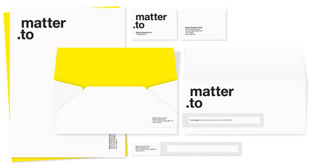
1. Matter strategic design


There’s no such thing as a free lunch! Or is there? Well if you can eat icons there is. Here are 35 fresh, high quality icon sets free for download. There is a vast amount of free icons sets out there and this is a mere sampling of some of the good ones. If you’re planning to use them for a specific application then you may need to hunt around a bit more. Some of the websites dedicated to icons have decent search facilities that can help.
While these are free, always check any usage limitations. For example some may not allow commercial use. Be careful of attribution if required, and also that you’re getting the set from an appropriate source.
I’ve grouped them into four rough categories: Web, Useful, Social Media and Awesome.

Web Icons

Web Applications Icons – Ray Cheung

A neat, colorful simple set of 3D web icons.

The Internet is full of information about design: educational articles, tutorials, rants,… there is a lot you can learn online. However, design books are still one of the best learning resources you can find. Reading books allows you to concentrate better and fully cover a topic, the following books should help you to do just that.

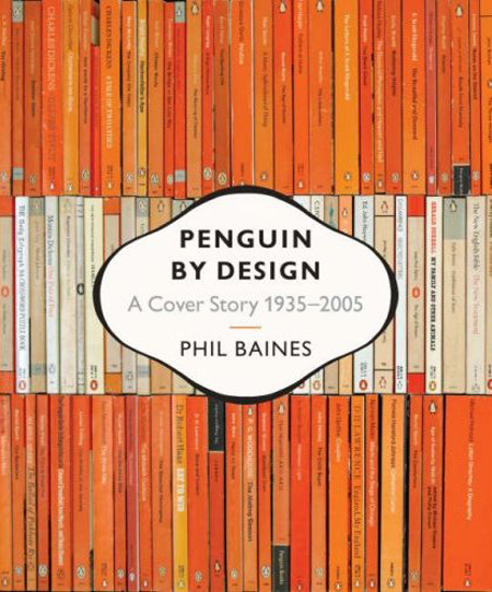
1. Penguin by Design: A Cover Story 1935-2005

Get inspired by the fantastic covers of Penguin books. In this book you’ll get a good look at the evolution of the books’ covers, but also the penguin logo itself. Features more than 600 illustrations.

Creating a minimalist design may look simple to non-designers, that’s why it’s often so hard to sell minimalist designs to your clients: they have the feeling that they could do it themselves. However, achieving simple yet powerful designs is a time-consuming task. I’ve made a selection of websites that did a great job creating efficient designs.

What these sites did right

Content going straight to the point

Hard to design a minimalist site if you have to fit in every products of your client with descriptions, 2′000 words and two menus with a bigger logo. On the web especially, content will be more efficient if short and targetted, it will make it easier to design a simple website.
It’s never a good experience to expect to see a webpage and to get a 404 error, most of us will just hit the back button on the browser when experiencing such a thing. Since errors will happen no matter how good your website is, it’s a good idea to improve your 404 page to make it as useful as possible, the main challenge being to keep those visitors on your site.

What should your 404 page be?